LOCAL/
22:58:56
22:58:56
Propel Site Redesign
A website UI/UX redesign for Propel, a Kleiner Perkins portfolio consumer company.
Propel Site Redesign
A website UI/UX redesign for Propel, a Kleiner Perkins portfolio consumer company.
Propel Site Redesign
A website UI/UX redesign for Propel, a Kleiner Perkins portfolio consumer company.
Propel Site Redesign
A website UI/UX redesign for Propel, a Kleiner Perkins portfolio consumer company.


Research
Research
Propel focuses on enabling low-income Americans with the ability to improve their financial health. However, upon viewing the Propel website for the first time, it was unclear what exactly the company did.
Propel focuses on enabling low-income Americans with the ability to improve their financial health. However, upon viewing the Propel website for the first time, it was unclear what exactly the company did.
Research
Propel focuses on enabling low-income Americans with the ability to improve their financial health. However, upon viewing the Propel website for the first time, it was unclear what exactly the company did.
Design
Design
The firm was founded in 2014 and has been running very successfully with over 5 million American users per month. With that said, I identified a big opportunity to redesign the website in hope of making the web experience much more clear, engaging and user-centric.
The firm was founded in 2014 and has been running very successfully with over 5 million American users per month. With that said, I identified a big opportunity to redesign the website in hope of making the web experience much more clear, engaging and user-centric.
Design
The firm was founded in 2014 and has been running very successfully with over 5 million American users per month. With that said, I identified a big opportunity to redesign the website in hope of making the web experience much more clear, engaging and user-centric.
Development
Development
In the development of this project, my goals were to: 1) Understand who the target demographic is more deeply, 2) Emphasize warmth, relatability and trust through imagery and colors, 3) Present a clear and direct idea of what Propel offers: an app and debit card, and 4) Allow this experience of managing benefits, which isn’t necessarily a nice one, to be a joyful and fun experience as much as possible.
In the development of this project, my goals were to: 1) Understand who the target demographic is more deeply, 2) Emphasize warmth, relatability and trust through imagery and colors, 3) Present a clear and direct idea of what Propel offers: an app and debit card, and 4) Allow this experience of managing benefits, which isn’t necessarily a nice one, to be a joyful and fun experience as much as possible.
Development
In the development of this project, my goals were to: 1) Understand who the target demographic is more deeply, 2) Emphasize warmth, relatability and trust through imagery and colors, 3) Present a clear and direct idea of what Propel offers: an app and debit card, and 4) Allow this experience of managing benefits, which isn’t necessarily a nice one, to be a joyful and fun experience as much as possible.


Concept
Concept
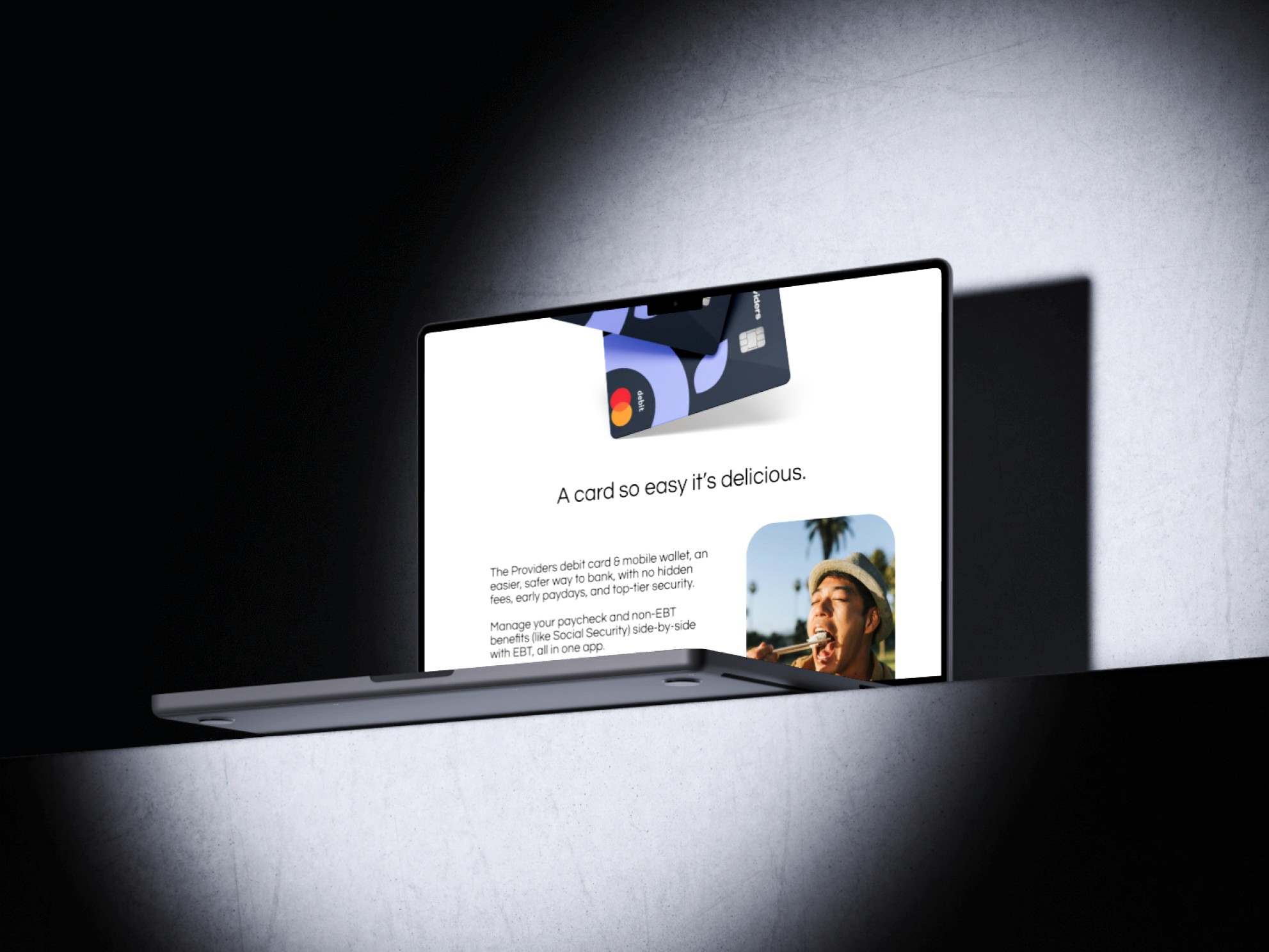
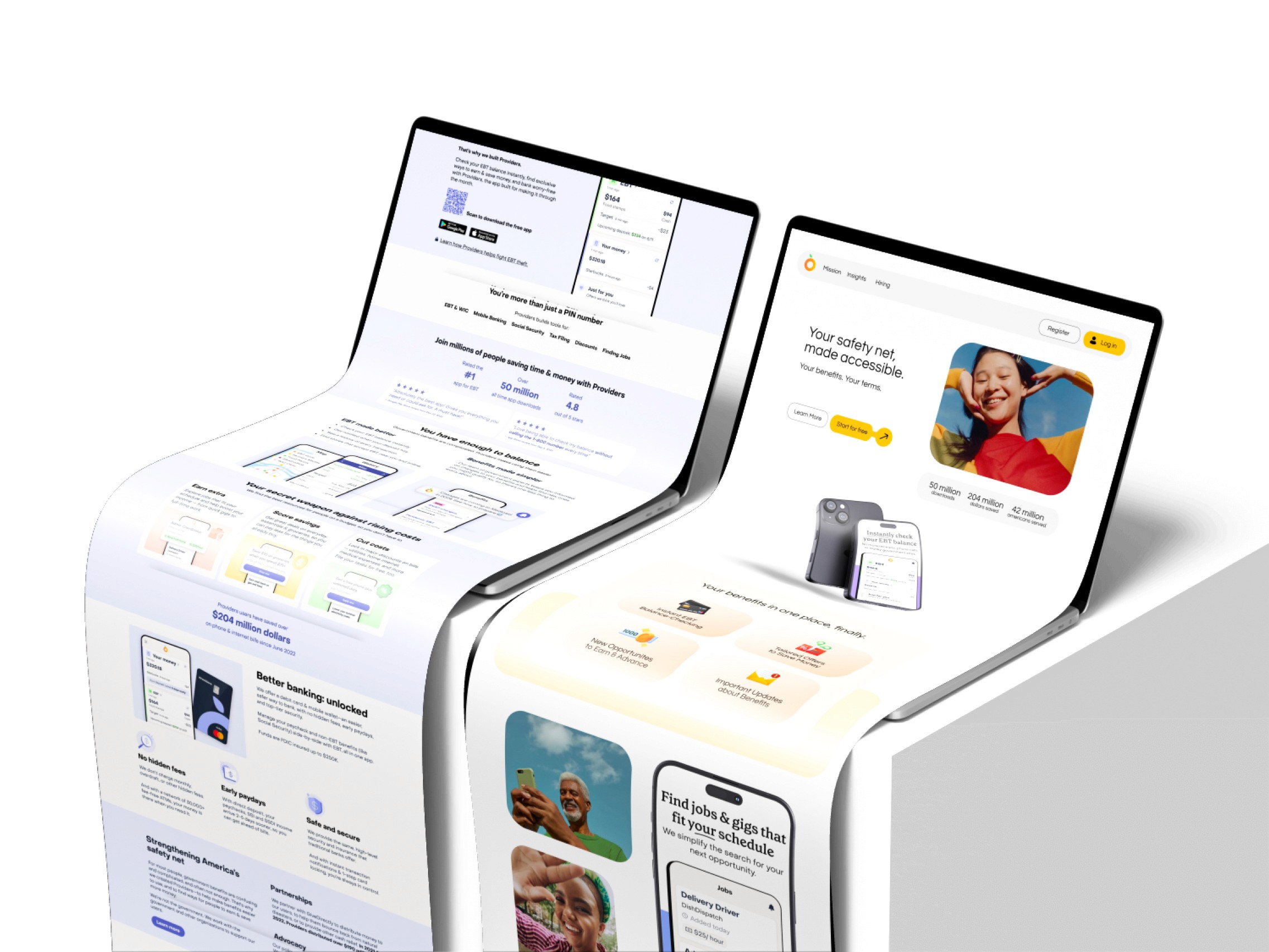
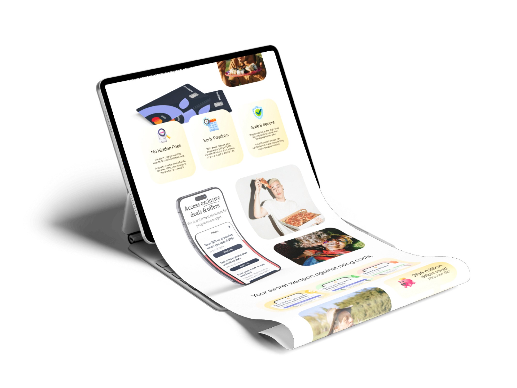
The result is a site that employs a modern and elegant design for the target market, with much more accessible copywriting. With stronger Call-To-Actions, the site now also allows itself to convert a much higher percent of users, supporting the ultimate goal of helping Americans improve their financial health. Before (left) and After (right) can be seen below.
The result is a site that employs a modern and elegant design for the target market, with much more accessible copywriting. With stronger Call-To-Actions, the site now also allows itself to convert a much higher percent of users, supporting the ultimate goal of helping Americans improve their financial health. Before (left) and After (right) can be seen below.
Concept
The result is a site that employs a modern and elegant design for the target market, with much more accessible copywriting. With stronger Call-To-Actions, the site now also allows itself to convert a much higher percent of users, supporting the ultimate goal of helping Americans improve their financial health. Before (left) and After (right) can be seen below.




More Works More Works
More Works More Works
©2024 JOHN REES
Go Back To Top
©2024 JOHN REES
Go Back To Top

